|
No one asked for this, but I deliver anyway. This is how I go about coloring my art - my method can vary but here's one of them. I really don't know how to explain shit so I'm sorry in advance. Full resolution recommended. Links to stuff in the description in case you're interested. The software I will be using in this tutorial is Krita (it's awesome btw) - you don't necessarily have to use Krita, any program will do. Alright! Into a fresh beginnin', let's get cookin' 👇 |
||||||||||||||||||||||
|
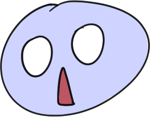
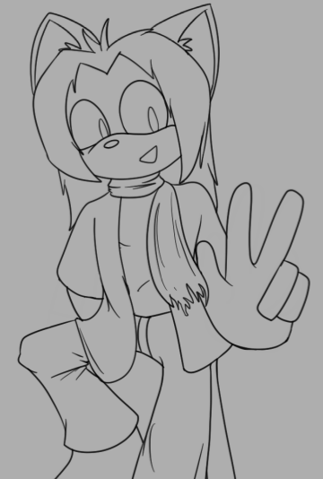
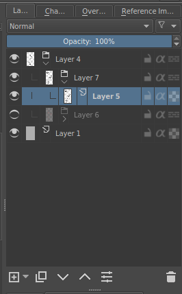
So you have your lineart? Good. That's step 1. I placed it in it's own group, within a group that will contain everything. The group below it is the sketch by the way. It's best if you use transparent lineart - however if you don't have one, don't worry! You can set the layer to Multiply mode and you can color everything under that. |
|
||||||||||||||||||||
|
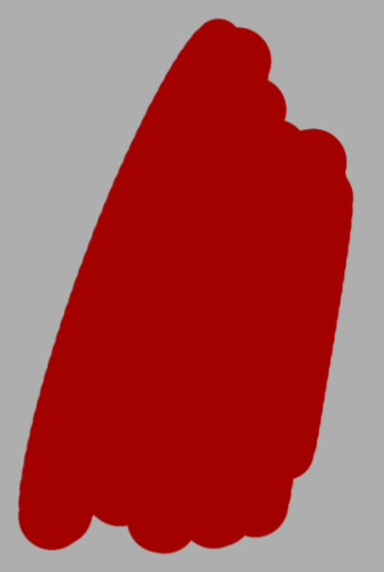
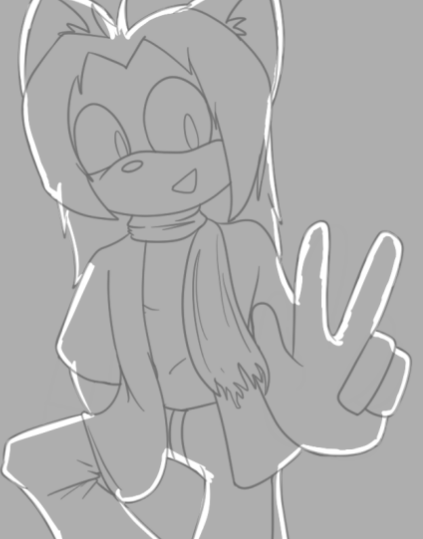
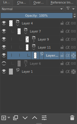
What I did here was put my lineart layer in a group, because the lineart will also be colored later, then making another layer below the group, then putting that layer in its' own group. Which will be the group for coloring. I traced the outline with the most frequent/base color in the character, which I will then fill with the paint bucket tool. |
|
||||||||||||||||||||
|
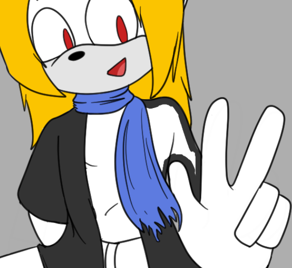
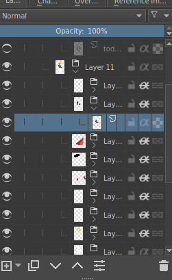
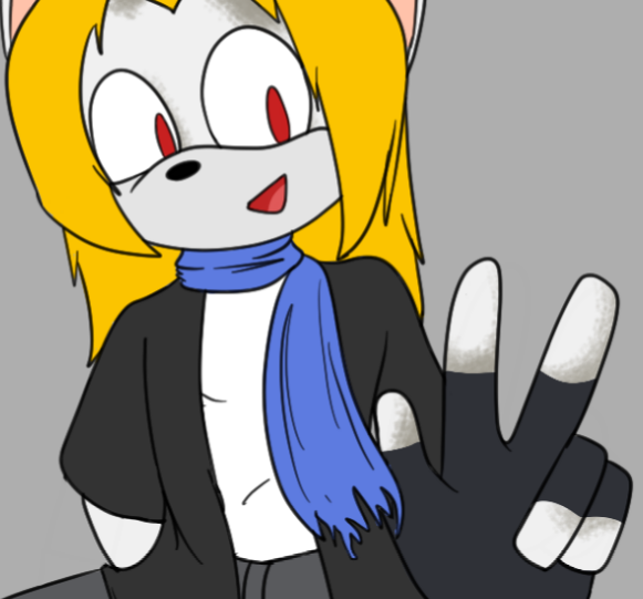
I enclose that layer in a group for the base color, then I make a bunch of layers on top of it, coloring parts of the character using the same method, then enclosing them in their own groups. Got all that? That's why I said folders are important in Krita, you don't need to deal with it if you aren't using Krita - however it's a nice way to organize The groups here are all clipped to the base color group. You may notice that the |
|
||||||||||||||||||||
|
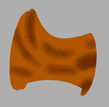
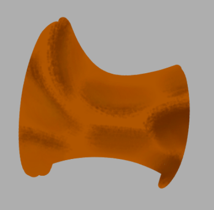
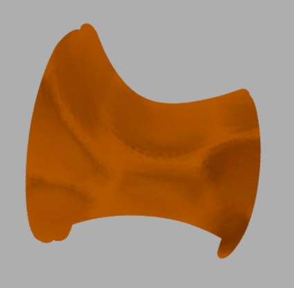
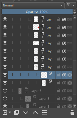
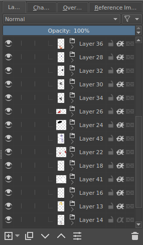
You're probably going to want to shade it - giving it depth and all. So what I did is, once I've got all of my coloring groups, I make a layer above the flat layer and clip it, and then I just shaded it. I'll show briefly how and what: |
|
||||||||||||||||||||
|
||||||||||||||||||||||
|
You can change the hues to determine the shade color to make it look better. 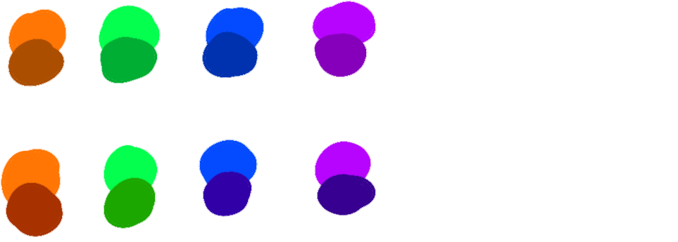
Or you could probably be lazy as I am and
use the base color to shade everything, |
||||||||||||||||||||||
|
||||||||||||||||||||||
|
||||||||||||||||||||||
|
||||||||||||||||||||||
|
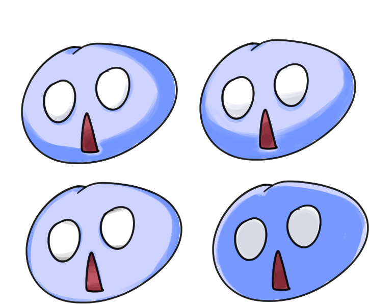
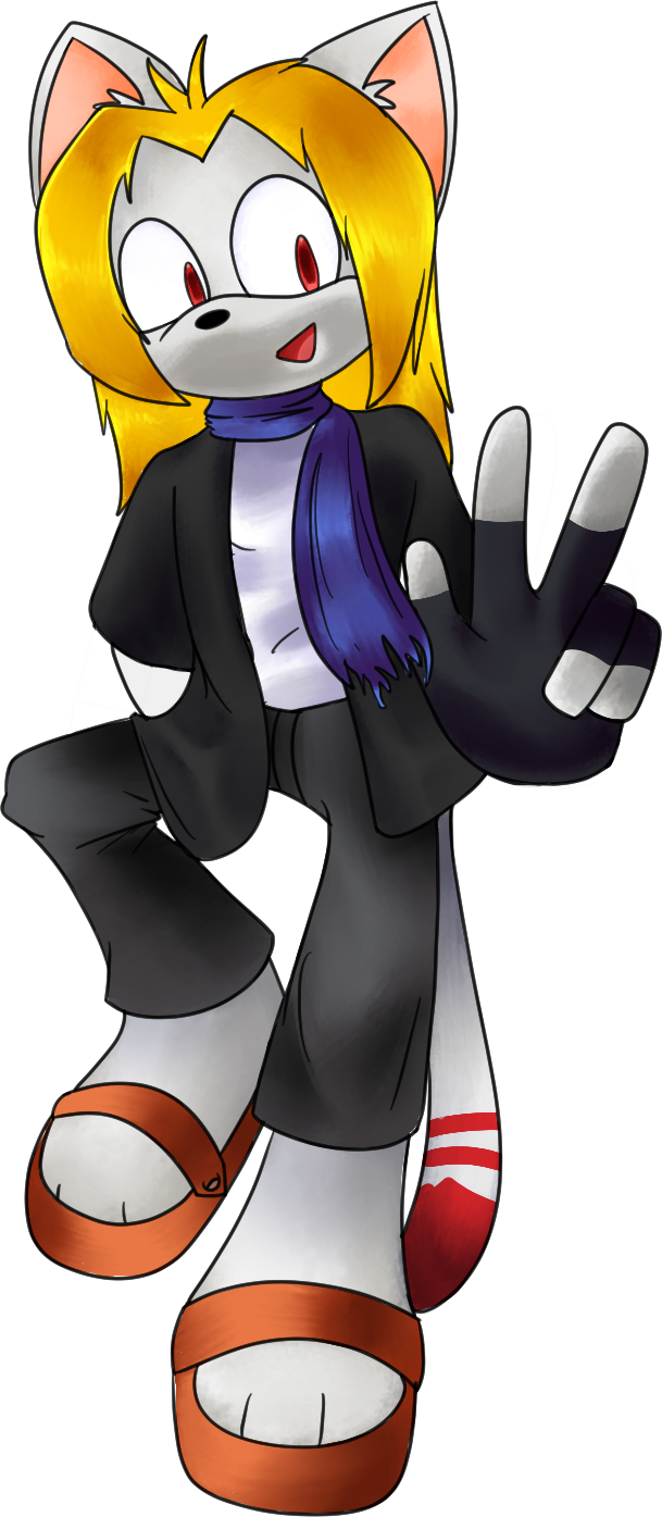
So once I've done all the shading on all the layer groups, I'll end up with... that on the left. Well it looks good already right? That means you're done... right? |
|
||||||||||||||||||||
|
not really LOL |
||||||||||||||||||||||
|
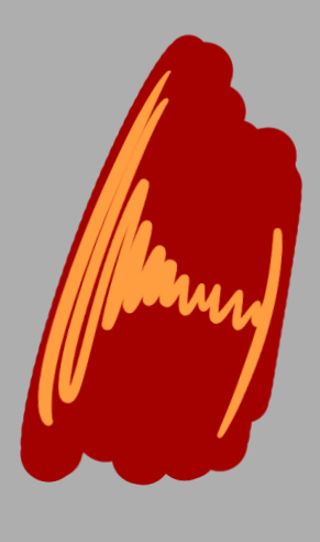
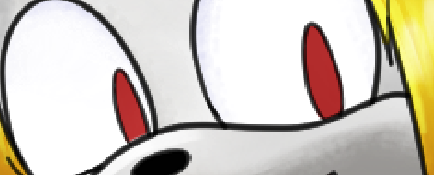
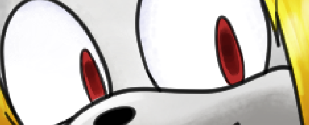
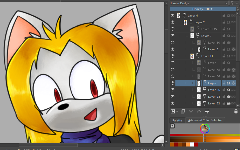
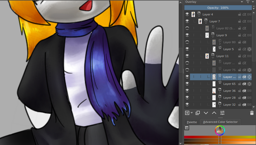
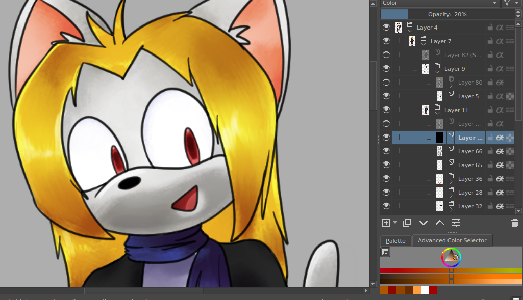
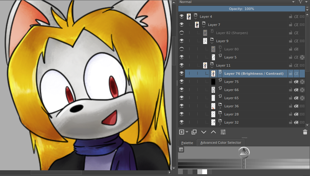
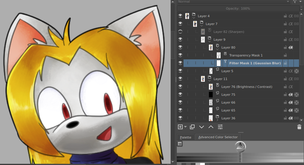
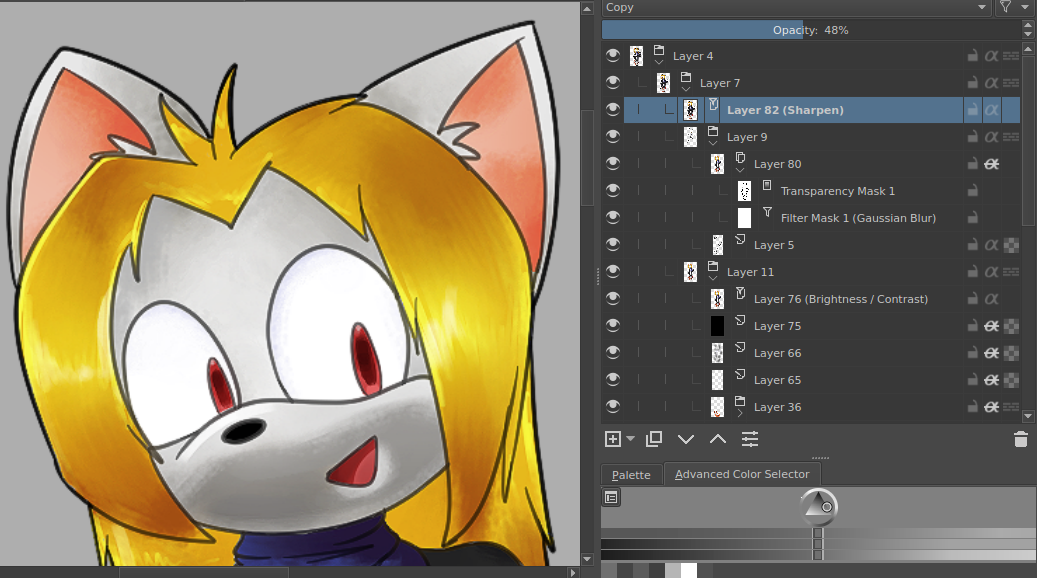
Well, the last thing that's left is enhancing it. I'll elaborate:
|
||||||||||||||||||||||
|
Aaaaaaaaand, el finito 👇 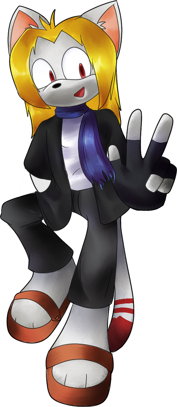
If you read through all of this, congratulations - you deserve an e-lasagna. 
Because e-cookies are overrated. |
||||||||||||||||||||||
