'Skeuomorphism' hacks on top of flat design
— updated on
It's the 2020s, which means that the kinds of interfaces I grew up with - having taken for granted, shrugged off, but I sorely miss now that I associate flat design with sorrowful adulthood and the realization that life doesn't seem all that simple and "free" anymore. Maybe I'm older now, so I view whatever was alive alongside my simple, hapless young self with rose-tinted glasses.
Flat design is perfectly okay, and in a lot of cases far more practical than what came before, which people call "skeuomorphic design", that is, mimicking real life stuff down to the textures. However stylish it looks, to a lot of people it sort of reduces design such that the only difference in implementation is merely font, color scheme and proportions.
Why
People point to responsive design and scalable graphics as the death of skeuomorphic interfaces. Skeuomorphic design by its very nature is detail-oriented, and that can result in a Thing using more resources for gradients and textures (be it image-based or generated in real-time). So people got rid of all that, and stuck to the bare basics of graphics - shapes, colors and sometimes even motion. Those three elements alone is what's being pushed in a lot of flat-oriented design languages in the 2010s and 2020s.
Now that displays are smaller, in the same way that logos should always be "readable" at small sizes so as to recognize it, UI should be fit for the smallest design so details must be reduced... at least, that's what they say.
I'm willing to argue that flat design sort of "democratized" graphic design in general, in the sense that anyone with even a little experience making something in Canva can fill in for me when I'm not "available"...
My experience as a design director for a small student-run organization has showed that when I implemented one of the new skeuomorphic-inspired styles, not many can emulate it (despite showing them a quick tutorial for how to do what I did). But then I went back to a pastel-like flat design language, and suddenly they can all do that and blend in easier.
So in that sense, in the same way that frameworks make it "easier for collaboration", flat design is relatively consistent and doesn't have much of a curve (relative to what came earlier), so anyone can join in and collaborate on something. It also makes it easier for a commoner to make something that society has deemed "looks good", something that you more than likely need to hire an actual designer for in decades past.
I should be pointing out by now that flat design is nothing new, you could check other articles covering flat design and they'll tell you that it goes all the way to Bauhaus, but I'm not gonna go deep into that.
Anyway, people realized that flat design has its accessibility issues when used in a digital context and tried to add back depth to it. Google's attempt — Material Design — reconciles that by imagining the UI as a stack of imagined "digital paper" with their own physics as to how they should interact. The addition of shadows help to differentiate some elements to others, such as buttons.
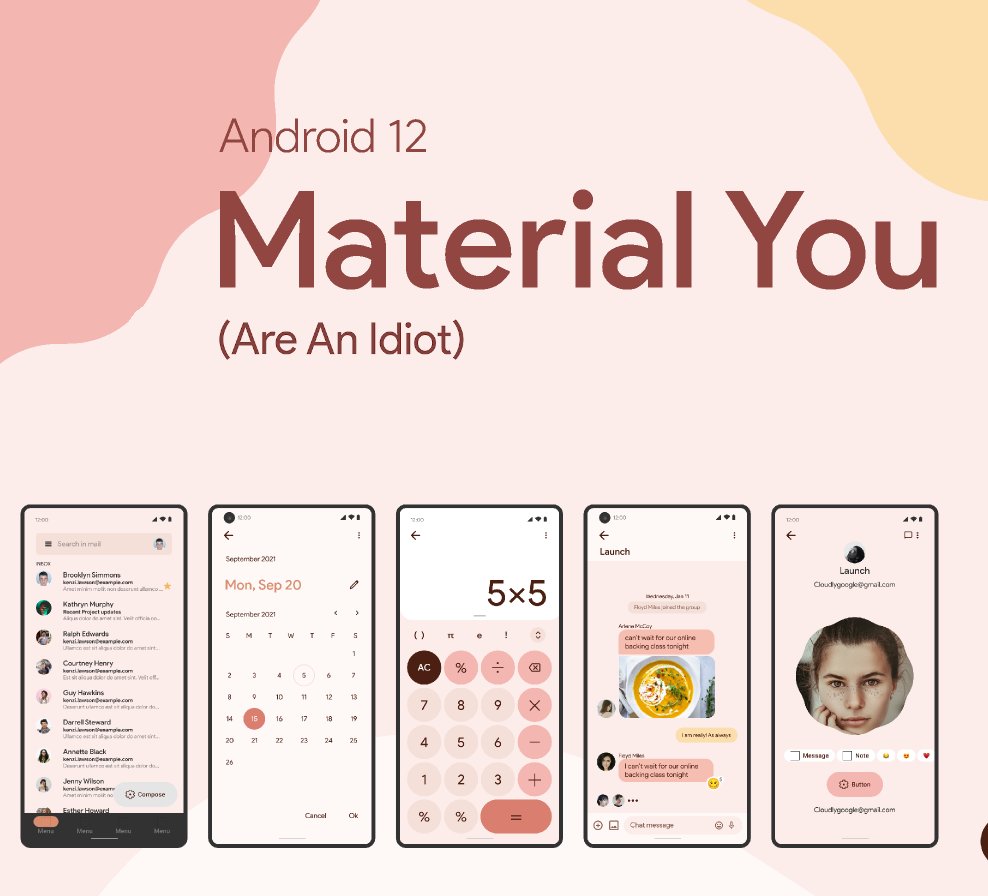
Then people thought it wasn't quite enough. History rhymes, so people begin adding back in 3D effects, and looked at the old designs for inspiration. Meanwhile, Google took a step back and got rid of shadows in Android 12...
How did it go?
tl;dr: Sad.
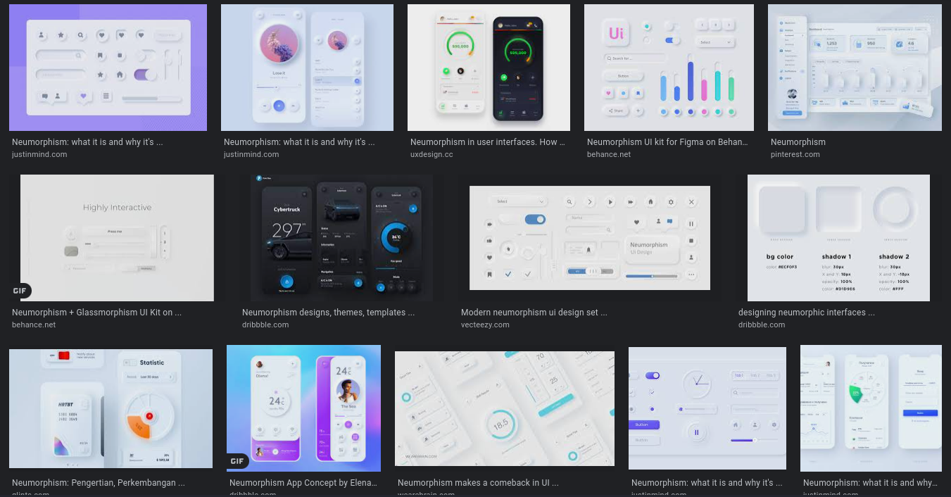
The sad attempt a few years back by people trying to bring back "skeuomorphism" is what they call "neumorphism". Drape the screen in either white or black, draw some faint outlines because they sure love their micro contrasts. Job done. It's even more same-y than flat design. At the very least, flat design actually has dominant colors!
Here, everything looks like it's been imprinted onto a surface by way of Filter → Emboss. Nothing actually looks real, either. It's just real "pretty". So pretty that it's bordering on invisible. Some people say that it's a pathetic "innovation" by people too scared to leave flat design, and I tend to agree on that.
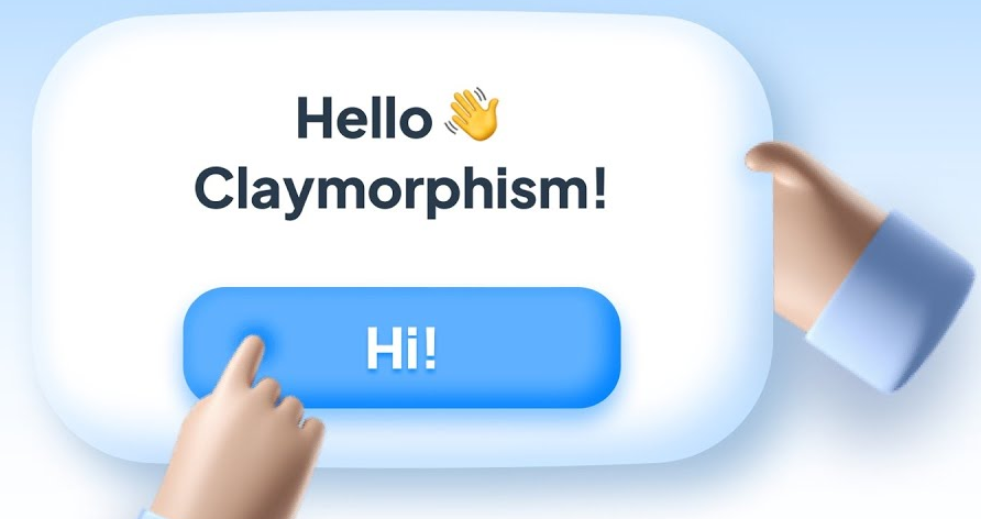
More recently, people are using actual 3D for elements, some people call this "claymorphism", because everything looks like it's been made out of clay. A lot better than the inaccessible stuff from prior, but it still suffers from "hey let's slap bevel and emboss on our flat stuff and call it a day".
And personally, I'm also a bit jaded from the whole friendly facade everyone puts on, because of the darker undertones behind it all (between corporate culture, cryptobros and accepted extremism alike). It's built to be friendly to the point of downright condescension, and that's not a bug.
I've always said these two are just hacks on top of flat design, as opposed to an actual attempt at bringing back the skeuomorphic spirit. I don't know why, but that may be because it has less graphical fidelity than the old school stuff.

Disappointed by the two, some people then try emulating 00s skeuomorphism. But I feel like a few of them do it too much. Gradients, textures and strokes are the basic elements of doing skeuomorphism, since they allow different types of material to be represented. But sometimes, in trying to sell something as reminiscent of the old, you put too much and it doesn't look all that great.
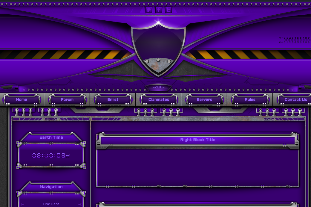
Then there's people who haven't changed at all, perfectly embodying the spirit of 00s-era skeuo. But as I said, in today's environment with such a diverse amount of screen sizes, you can't exactly bring back 100% of the 00s soul, since you also need to consider if the layout would size properly... then again, you could of course have two entirely different themes, only split by breakpoint. But that's not 100% practical.
My hot take
So how do I see things? First, some more inspiration:
Design critic Eli Schiff (of @humansofflat fame) seems to favor what he calls "dimensional design". Compared to what people call skeuomorphism, I understand it as "basically that but without the excessive detail". In other words, skeuo with class. Certainly looks like the design language that Apple has adopted circa 2013 or so. In that respect, Flash buttons of early 00s Newgrounds can be considered skeuomorphic. You have material emulation, and you have detail. But it still looks toony, so people don't consider that classy.
Responding to the visual refresh of macOS 11, he put out a more tasteful reimagining, political rumblings aside. People had thought the puffy look that might've precipitated "claymorphism" is a return to dimensional design, but it isn't as "classy", and has the faux-friendliness look I described previously.
Next, to people with preinclinations about what they think the "old-school" design looks like:
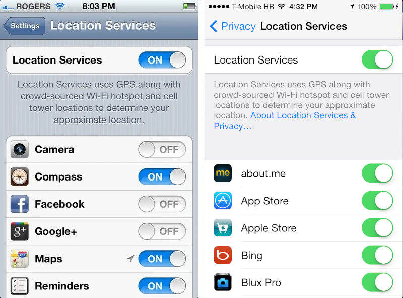
To repeat, skeuomorphism is, at its core, emulating the real to make new things familiar. When the digital realm is a new field, you want to throw some kind of real-world material at it to look as if the user can interact with it. In that sense, a rectangular element should look like some real surface, which can be accomplished by placing textures in it. When thinking of material, not everything should be glossy! If you did that, you might have only seen Windows Vista. Now, think of real world material — what do they look like? Take your pick:
- Matte
- Glossy
- Leather
- Wooden
Despite calling for the return this kind of stuff, I do still think we can dial it back a bit. If in the 2010s you have literal photos representing objects, let's use simplified but depth-like representations, that means using FontAwesome and the like. If in the old school you have every kind of material imaginable, let's pick one that's no-frills but still makes elements distinct enough from each otherr.
Effectively, that is to say that just like neumorphism and claymorphism, this should be feasible as a hack on top of flat design. Only that this is closer in spirit to the 00s and 10s skeuo, yet still feasible, accessible, and doesn't look condescending. Just something that doesn't want to get in your way, that's all. We do have the technology, after all.