Theming this Site, and Other Stuff
— updated on
Each time I aim mindlessly on the Internet, I stumble upon some visual styles that evokes simpler times. That is, anything but the extremely rounded, flat, and animation-intensive ones of today — that hides how much of a clusterfuck of the underlying system is inside. Sometimes I gaze upon something skeuomorphic, sometimes it's Aero, sometimes it's Holo. And sometimes, it's the industrial embossed look of the 90s.
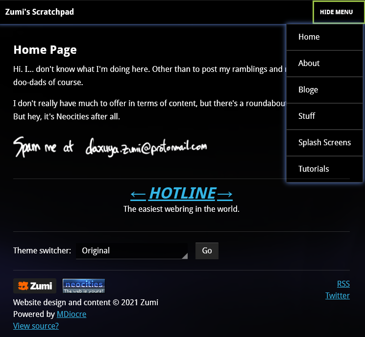
This site already is styled after the glossy stuff seen on Windows Vista and its contemporaries (OS X 10.5, iOS 4). But I guess I needed to also make my site look like all those other stuff, too. My friend's site has this theme switcher, so I was inspired to put one up on mine as well.
So from now on, this site will use JavaScript not only for the blog reading time, it also uses localStorage to save theme preferences - rest assured, everything will still be okay if you have NoScript.
About that New Theme

The first theme I'm trying out here is Android's Holo theme. Not the Holo that most people know, however. It's the early "Holo" look that was on Android 3.x (Honeycomb). I just love the cheesy Tron look they have going on back then, it's underrated as hell. I suppose this wasn't liked more because 3.x was a rushed, tablet-only release. Even then, as I'm currently (painfully) writing Android apps for an assignment, the Fragments stuff they introduced here is pretty neat as well.
I borrowed some code from the existing Holo Web project, these look pretty faithful already. I'll probably have the later (4.x) Holo look here eventually — especially since these are the ones I've actually grown up with.
I plan to eventually have a wide range of themes representing different eras, maybe ones with icons as well. And yeah, that includes the original Material Design and (if I can even pull it off) the new "Material You" design. On second thought, I suppose this is just my Time Machine page but extended to the entire website, huh.
Reducing Dependencies
Another thing I've done is make it easier for my own site to build by reducing the dependencies needed. In the end, mdiocre and docutils are now pretty much the only real dependencies (with pygments being optional). Most of this work was writing replacement tools that just do one thing I really needed from each. Boy, was it satisfying.
The first step on reducing dependencies was by rewriting the RSS feed generator. It used lxml, which — on some setups — is a pain to install. So, I made it just use Python's built-in XML serializer. There is still yet some quirks to be fixed, but I think it works well enough.
Next up, I "flattened" the templates by just doing it in HTML instead of Pug and pypugjs. Since I really needed to change the links to the base path, this is just handled by mktemplate.py.
Last, I decided that I was just gonna do my stylesheets in plain CSS. Each style is its own folder with a bunch of CSS files that are then strung together by the make process. My color themes rely on prefers-color-scheme, something that lesscpy doesn't support — so that's why there was a separate color-themes.css that was included.
The overhead that was reduced by getting rid of color-themes.css turns out to just be replaced with the theme switcher feature, and the desire to just have one master template. Because everything is just one template, the blog timer script is on every page now. Cringe, I know. But no, it gets cringier than that.
The theme switcher feature uses a script in the HEAD. Apparently, it does work to reduce flash-of-unstyled-content. Well, if your stuff is cached anyway. Mileage may vary depending on browser and connection circumstances, but we'll see.
Next up: Themes, part 2