30 years.

Thirty years of web evolution
has brought the best the Web
has to offer.

...Not.

Every website just looks like this now. Yawn. What the hell happened?

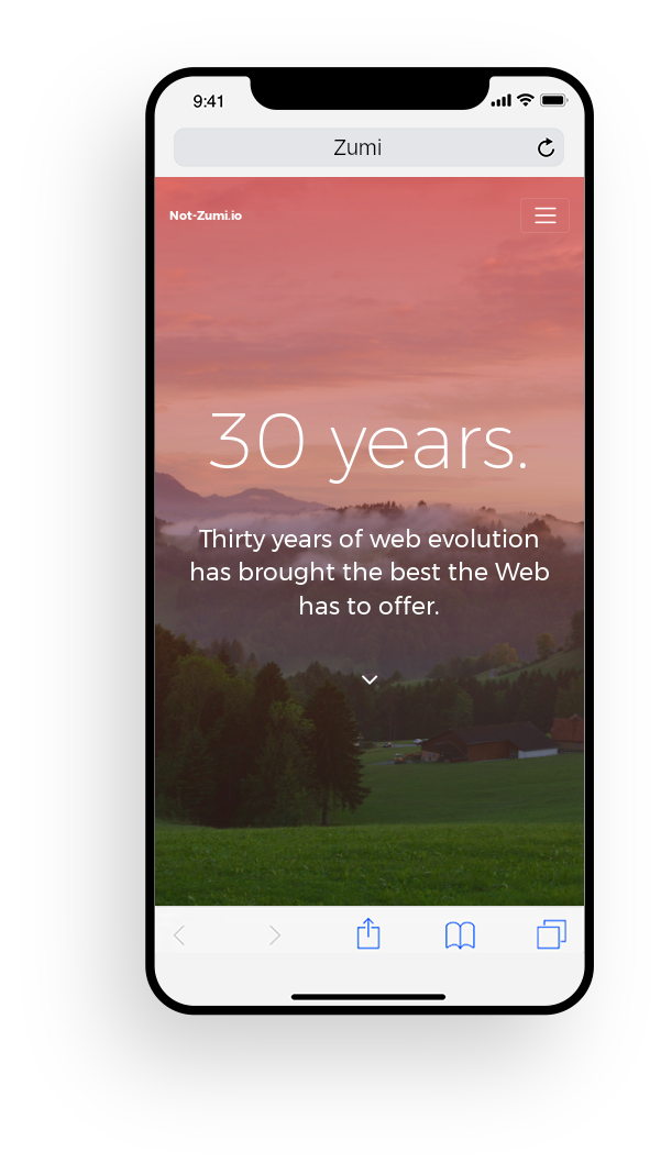
Every website worth its salt has this samey look now. I don't know. It's probably just Current Year Trendsâ„¢.

Rose-tinted glasses

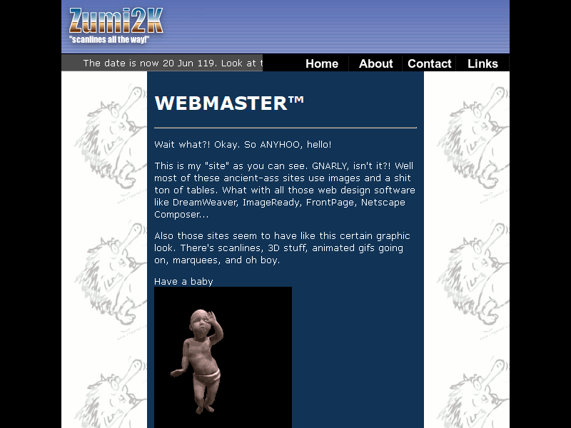
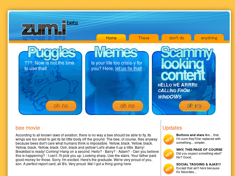
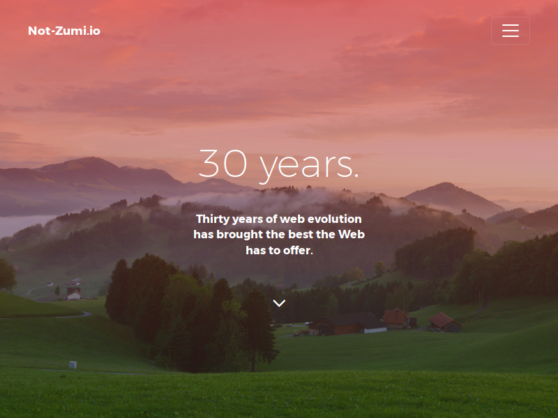
There has always been a thing that defines a given era. Gratuitous usage of <iframe>, <blink>, <marquee> and <table> for the late 90s-early 2000s Geocities era. Design-based websites and the gradient-laden revolution for Web 2.0 and the late 2000s. And now, stylish, humanist, minimalist, flat trends for the 2010s and into the 2020s.

Even so, there has always been some people that stand out and do things differently. When the rose-tinted glasses are on, I'd say the past had more in terms of originality. 

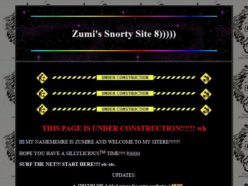
Though, most of the websites are really just the same old animated gifs, dividers, tiled wallpaper, background MIDI, Times New Roman. The cheesiest possible crap you can ever put on a webpage. That's probably what we all thought the web was good for.

Some took the web a little more seriously and you have imagemaps and neat retro landing pages that have 90s CG and some links on the navbar. Some of the designs still kind of hold up today, if not for a font change.

Today, I feel things are getting more "generic". Monetization are now the main goal of everything, and so creativity is sort of stifled in favor of profit and conformity. My_Space died and YouTube spins a worse layout every few years. And then there's this visual style. It's kind of the perfect form of generic stuff that everyone wants to use. Everyone loves this, so everyone uses this.

Not only does this happen to the Web. We get these boring-ass, samey-looking bitcoin ransom crap everywhere. Big money's the name of the game. Whatever happened to the fires that used to be thrown around on our desktops? At least Rensenware and Petya brought some kind of class.

Back to the Web. Everything also feels less "sovereign". Everyone relies on outside CDNs. Makes for easy code copypasting and saves on bandwidth. Downside is, it's centralization. CDN down, you and everyone else are screwed. Oh yeah, CDNs can track you, too.

I've been hearing horror stories of modern automation, advertising, tracking, and algorithms. Here's another one: Data consumption.

That was easy.

WYSIWYG web generators and templates have been around since forever. And they have always been a pain and a blessing.

Anyone who knows HTML may have their eyes bleed out just by looking at the source code of a WYSIWG-generated page. Formatting spam. Incorrectly placed elements. Meta spam. Page generator trash. Manual positioning hell. FrontPage and (Netscape|Seamonkey) Composer suffers from this. Publisher is even worse. *shudders*

Fast forward to present day, and there's now metric tons of JavaScript vomit. Minified, it's near epileptic to anyone daring to look more than the visuals at surface level. Who the hell even knows what happens there. Coupled with today's visual style, it's pretty ironic. The design says "minimalist" but it takes a century to load. And maxes out your CPU. Have fun listening to CPU fans inside your computer whirring up.

I'm a little scared of WordPress, Wix, and Squarespace. But idk, what better way to deal with this? Well, the editor I'm using to make this runs on a tree-model inspired by the very HTML code I'm writing indirectly. I think that's okay. But the thing is, the editor is sort of a snorty freeware and will jam its tag, probably even in the Pro version. Good thing I know HTML. But lots of people don't. ðŸ˜ž

Why is my browser running so shitty and my fans running like hell?

Because I've got a video running down below.

The Web is basically McDonald's now.

Frameworks are like fast food.
Websites eat them up raw and get bloated.

So. You're a startup. You want to get going as fast as possible. You look around, looking at anything that would impress anyone who sees it. You pick a template with all the right visuals. Got parallax. Got a picture of some hipster in a Starbucks or whatever. Cool! Change it a little, add some (*cough*bucketloads*cough*) of ads and ship it!

Well. Not everyone is lazy enough to use one of these templates, but every website looks so same-y that no one can even tell.

As a web developer, the features on your site are not enough to satisfy the great design vision in your mind. So you Google (or DuckDuckGo) around looking for MOAR libraries to use. You pull in jQuery and everything that depends on it.

Ooh, a parallax library. Ooh, an animation library. Ooh, a scrolljack library. Ooooooh. FuckAdBlock. Niiiice.

See an image you like? You plop it in and paint it with a CSS gradient. You leverage Web tech to its' fullest... while flushing performance down the toilet.

Do you really need those images? At least optimize it or something. You're using long-ass class names and IDs to... deter adblockers? To be secure? You load tons of entire JavaScript libraries just for one feature? You seem to forget that there's people with slow ass-connections. Yes, even the first world has those problems too.

Man. Page generators, you can easily make as advertisey as possible. Convenient, but I'm scared of what it'll do to my customer's data plan. And probably what it'll do to my customer's privacy. I'll just obsessively optimize it. Using a ~500mb data plan really takes things in perspective for me.

Of course...

I gotta admit, this is a nice-looking design base.  The fontwork and layout are on-point. It's too tasty.  In spite of the rant I just spewed in the last few paragraphs, I filled this with redundant JavaScript libraries, unminified shit, a 10mb video and >1mb images just to take the piss out of the web.

Most of the market share now is on mobile. Because... little doodads you can carry about anywhere and everywhere. Lookin' like cyberpunk too. Very convenient. Responsiveness is the hot word of the decade, so you better be considering that if you design anything.

Out with mobile-specific web pages, and out with mobile-only suffering. Instead... let's make mobile and desktop users suffer!! Mwahahahaha- oh.

Oh. Responsiveness? I thought you only meant responsive layouts! I didn't think to make this website actually have responsive performance! I have a top-of-the-line dev machine that is totally unrelated to what everyone else is using! I didn't think to test this on a measly, entry-level 2GB 64-bit laptop! Whoops!

Well. Mobile-first design... Hamburger menus, huh? I seem to see it being indiscriminately used even when not on a mobile setting. Getting a little lost, are we.

Here is the web pyramid as we observe it in the wild: A base layer of HTML, a huge pile of crap, and on top of it all, a whole mess of surveillance scripts.

Maciej Cegłowski
Idle Words, Website Obesity. 2015.

Enough with my rambling.

Here's where I dump random Bootstrap elements. Like last time.

You

Gawking at the wondrous design patterns that you totally have never seen before.

A hashtag

I don't know how you pronounce IRC channels.

A spinner

Like a record, baby.

Holla holla?

Get dolla.

$99.99

Buy

More dolla.

$499.99

Buy

E X T R A
D O L L A

$999.99

Buy

Fun fact

Java is to JavaScript as Car is to Carpet.
Why the hell did someone think it's a good idea to have these kind of similar names to radically different tech, anyway? The tech industry seems to love confusing people.

Join our goddamn spam list.

i-i'm desparate alright? they're gonna saw off my fingers. my stockholders need me. hel p

In closing, web design still kinda sucks.
Also. Those buttons are illustrative.

Made with sarcasm and a bit of contempt by Zumi.

Travel to other eras: 1998, 2003, 2008, 2018?


Based on the Now UI Kit. License. Made with Pingendo, which is a pain tbh. Hero images from Travel Coffeebook and Negative Space as well as Coverr, public domain (CC0).